Wayfair App
Adding a feature to improve and expand Wayfair’s augmented reality (AR) experience
Project Timeline: February-March 2023 (7 weeks).
My Role: Sole UX/UI Designer.
My Tools: Figma, Maze, Optimal Workshop, Notion, Procreate, Zoom
(This is a personal project)
Overview
Project Background
There is a special correlation between where we choose to reside and the effect that environment has on our cognitive functioning and physical and mental health. Additionally, what we put in our homes serves as a reflection of who we are and how we want to be perceived by others. This could explain why as consumers, we are picky about how we choose to decorate and furnish our homes. In a post-pandemic world, more people than ever are working remotely and spending more time within the confines of their homes. According to a new study, 55% of Americans made a significant change to their home decor in 2020 and 73% of respondents agreed with the statement “My home is my sanctuary.”
The Problem
For e-commerce companies like Wayfair, customer returns are an expensive problem. According to returns software provider, Happy Returns, e-commerce return rates can be anywhere from 15-40%. Furniture companies can potentially feel the weight of this issue even more so due to the bulky nature of their products and the respective cost of shipping.
Returns are expensive and so are unhappy customers stuck with something they don’t want. This leaves Wayfair with a lose-lose situation.
The Solution
Improving the returns process can only do so much, as returning large items is expensive no matter what. Therefore the only feasible solution is to reduce the rate of return as much as possible.
Adding more dynamic browsing and visualization features to the AR experience it would allow users to other items available for AR and view multiple items in their space.
Being able to add more than one furniture or home goods product when visualizing using AR could provide several benefits to users, including:
Better visualization:
Adding multiple furniture products allows users to visualize how different pieces of furniture would look together in their space. This can help users to better plan and coordinate their furniture choices, ensuring that everything fits together and looks good.
Convenience:
By being able to visualize multiple furniture products at the same time, users can save time and effort by not having to visualize each piece of furniture separately. This can make the shopping process more convenient and efficient, ultimately leading to higher customer satisfaction.
Flexibility:
Adding multiple furniture products gives users the flexibility to experiment with different furniture combinations and arrangements in their space. This can help them to find the perfect combination that meets their needs and fits their style preferences.
Enhanced decision-making:
Being able to visualize multiple furniture products can help users make more informed decisions about their purchases. By seeing how different furniture pieces look together in their space, they can better evaluate which pieces will work well and make more confident purchase decisions.
Bottom line = Profitability
If the consumer is able to confidently visualize and purchase multiple items this could lead to the sale of more items in general with a higher customer satisfaction rate and therefore lower return expenses.
Primary Research
Assumptions & Risks
First, I wanted to ensure that I addressed what underlying assumptions I had about this problem —what did I already believe to be true and how could I approach this project without my personal bias?
Assumptions
I assumed that people are buying more than one item at a time and that they are buying items that are meant together on a regular basis
I assumed that returns were a cumbersome process for everyone.. not just me.
I assumed that people find augmented reality features useful to begin with
Risks
Since it is a rather new technology, it may be hard to find participants with enough experience with AR to speak to its strengths and weaknesses.
Competitive Analysis
I kicked off my research by completing an in-depth competitive analysis to help identify the key players in the market, their strengths and weaknesses, and how they are positioning themselves. This provided valuable insights into the market landscape and helped me identify areas where it can differentiate itself.
I then broke things down even further and assessed the competitors by the features they offer within their AR experience.
I gained the following insights:
3/4 competitors already had a feature where you could view more than one item
Across all apps, there was no way for users to compare product information of the items put in their space
The solution must enhance Wayfair's competitive edge by allowing users to compare multiple items in their space, surpassing competitors with similar features.
Displaying product information while visualizing multiple items improves the user experience and decision-making. Integrating a browsing feature enables users to explore additional AR items and discover suggested products, further enhancing engagement. Overall, this solution positions Wayfair as a leader in providing a comprehensive and user-centric AR experience.
USER INTERVIEWS & GOALS
I conducted and recorded remote interviews over Zoom with five participants to gather rich and detailed information about users’ needs, preferences, and pain points. I wanted to directly engage with and gather insights from users who have experience using the app or similar products.
User Interviews
Number of participants:
Four females and one male
Ages:
26-42
Education level: Bachelor-Masters Degrees
Research Goals
Understand users' ideal AR experience to inform the design of Wayfair's AR feature.
Identify the variables and specifications users consider when deciding whether a product suits their environment to ensure they are represented in Wayfair's AR feature.
Understand users' motivations for using AR to ensure those factors are considered during the design process.
Identify barriers to the current AR experience to discover opportunities for improving Wayfair's AR feature.
I wanted to know what users find most helpful or confusing with their current experiences with AR and what they would like out of future experiences.
Research Insights
First, I wanted to know what the user’s current experience with AR looks like and how does it currently meet or not meet their expectations. This would be valuable info to use for informing my design in the most effective way.
After recording and writing down insights from my users interviews, I organized this information into groupings of themes regarding users’ motivation, pain points and goals.
User Goals
1. Users want convenient experiences
Many users reported that they enjoy the benefit of not having to physically measure anything since many AR experiences provide measurements. User’s
“AR is nice because I don’t have to physically measure or find a tape measurer in a drawer somewhere”-Brianna
2. Users want to save time
Users shared that AR can save them time in a few different ways. For example, some stated that it can be time-consuming to either go out to a physical store to view the product or the alternative of ordering it and waiting for it to arrive.
“After assembling an item you’re kind of screwed if it doesn't work out because you would have to take the time to take it apart and return it.” - Madison
3. Users want to make informed decisions about their purchases
Making a purchase online can be risky, as users are unable to physically interact with the product or see it in person before making a decision. This can lead to uncertainty and doubt about whether the product will meet their requirements.
“It’s nice to get an idea if something will fit in my room and go with the rest of what I have going on”-Riley
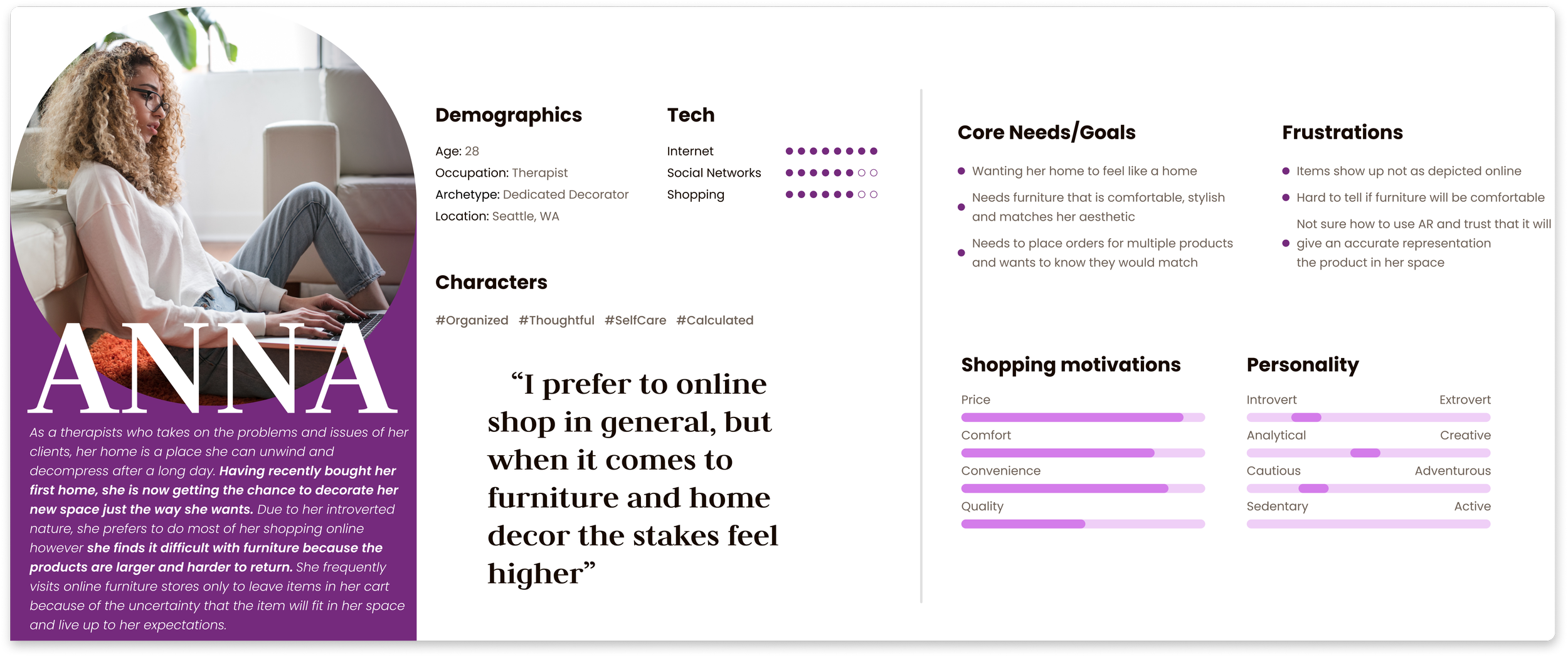
USER PERSONA
Creating a user persona helped me better understand our target audience's needs and behaviors, and gave me a great resource to refer back to so that the design of the app meets their expectations and provides a seamless user experience.
USER FLOWS
Flow 1
I began my ideation phase by creating a user flow of how my persona might interact with the features I had in mind
LOW-FIDELITY ITERATIONS
In the low fidelity stage of this project, I decided to first create sketches using Procreate on my iPad so I could more quickly ideate before investing significant time and resources into creating detailed wireframes. Sketching allowed me to explore various layout and functionality options quickly and easily, with the intention of leading to a more refined and effective final product.
Sketches
Low-Fidelity Wireframing
After sketching, I decided to bring my ideas up to some low-fidelity wireframing in Figma. In previous projects, I found it to be cumbersome to iterate after testing my high-fidelity wireframes because I had already put so much time into them. I wanted these lo-fi wireframes to hold enough information and content so that usability testing participants could get a basic idea of the concept during my usability testing.
Below are the lo-fi wireframes from three out of the four flows I tested
TESTING & IMPROVEMENTS
Once low-fidelity wireframes were finished, I connected the screens together to simulate the experience of these concepts so that they could be tested and iterated later on.
Prototyping
Usability Testing Plan
Now that my prototype had taken shape, I had to validate my ideas —were they usable, useful, and helpful? I arranged usability tests with my peers and friends via Maze to gather insights on whether or not I had taken steps in the right direction.
Number of Participants: 10
Ages: 24-42
Tools: Maze, FigJam
Task Flows to Complete
Swap for a similar product
Add a similar product to space and compare dimensions
Finding a product via the Discover feature
Adding a product to cart and saving the rest for later
Testing Goals
2. Ease of use:
I wanted these tasks to be simple and intuitive to complete. By measuring the number of misclicks on each stage of the flows it would allow for insights into how easy it was for users to navigate them.
2. Time spent on screens:
I wanted to ensure that the tasks were easy to navigate. If the user spent an extended amount of time on a certain screen that would indicate that they may have felt stuck or weren’t sure what to do
After conducting some testing via Maze I analyzed the results to discover where there may be holes in my design and what revisions to prioritize. Below shows my process for organizing through user feedback for the various task flows I tested
Analysis & Prioritization
First I clustered feedback and misclick rates into themes and then placed them on a prioritization grid for further assessment
Overall feedback was generally positive! Many users left comments praising the idea and deemed it useful 🎉
Some even mentioned that they felt the features I had added were integrated seamlessly into Wayfair’s previously established branding and UI.
The main success metric for these flows was the ease of use as measured by the number of misclicks that occurred per screen along with general feedback and comments.
Based on the synthesis above I identified the following themes:
1. Usability of the product cards went in an unexpected direction
For all flows that required the user to either add or swap a product in their space, most users’ first instinct was to click the product card itself instead of the designated buttons.
“I was expecting a clearer way to swap for a different option. It took me a few clicks to figure out how to do it.” -Mark
2. Confusing Icons
Another source of confusion for users was figuring out the icons. For the “Discover AR” flow many users clicked the list icon and many other places on the screen before finally finding it. Similarly, during the “Adding to cart and saving the rest for later” flow, many users found the icon to be unclear and many tapped elsewhere in an attempt to complete this task.
“ I found the icons to be unclear. I love the idea of this feature! Maybe it's just me - but I felt like I had to click around quite a bit.” -Sam
3. Users got lost trying to save products to a list
After reviewing comments and the heatmaps for the “Adding to cart and saving the rest to a list” flow it appeared that users did not expect this feature to be on the screen itself but rather on the product info modal".
“Would have expected to add to cart from the list option --would be cool to be able to do those all at once” -Olivia
With the above themes in mind, I brought my wireframes up to high-fidelity with the following improvements
Revisions & Improvements
1. Interactive product cards
Problem:
When faced with the task of adding or swapping a product users tapped the product card itself instead of the “add” and “swap” buttons.
Solution:
I removed the buttons from the default product card and instead made the product card interactive. This allows for the user to tap the card and then be presented with the actions available. This orientation also allowed more room for text to make the actions available more clear to the user.
2. Clarifying Icons
Problem:
When asked to use the “Discover AR” feature most users felt lost and weren’t sure where to click because the icon did not accurately represent the cabilities of the feature.
Solution:
Some of the participants suggested either making the icon a plus or a search icon. I combined these ideas by replacing it with a simple magnifying glass with (+) in the center. This represents the search and add capabilities of the feature.
3. Saving items to a list
Problem:
Instead of tapping the list icon on the side bar, participants first instinct was to click the items individually and add products to a list via the product info modal.
Solution:
I added this action to the product modal so that it was more easily accessible and grouped with the “add to cart” button.
By having the wish list button in close proximity to the cart button, users can quickly toggle between the two options, making it easier to decide whether to purchase an item now or save it for later.
Final Showcase ✨
Flow 1: Swapping for a similar product
Flow 2: Finding adding a suggested product to room using the “Discover AR” feature
Flow 3: Saving a product to a list for later viewing
Reflections
Change in the process
Looking back on my process, I think it may have been more beneficial to conduct a competitive analysis after I had completed my user interviews.
By conducting user interviews first, it could have allowed me to have a better understanding of the user's mindset and priorities. This information can then be used to inform the competitive analysis, allowing me to evaluate how competitors are addressing these needs and how successful their strategies have been.
Testing metrics
Along with gathering basic feedback (asking open-ended questions) I wish I would have also required users to rate their satisfaction on a scale regarding each of the various flows I tested.
Using a scale (of 1-5) to measure user satisfaction could have helped me to quantify and compare user feedback.
In retrospect, I wish I would have been more specific when gathering user feedback during the usability testing stage.
Other projects
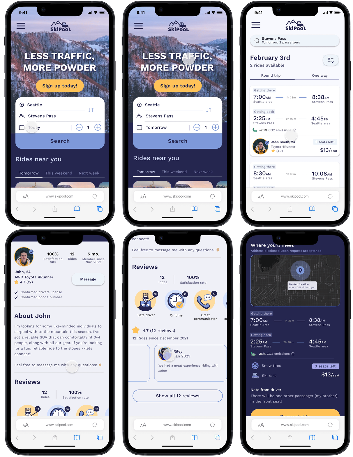
Responsive web design for a ride-share service for skiers
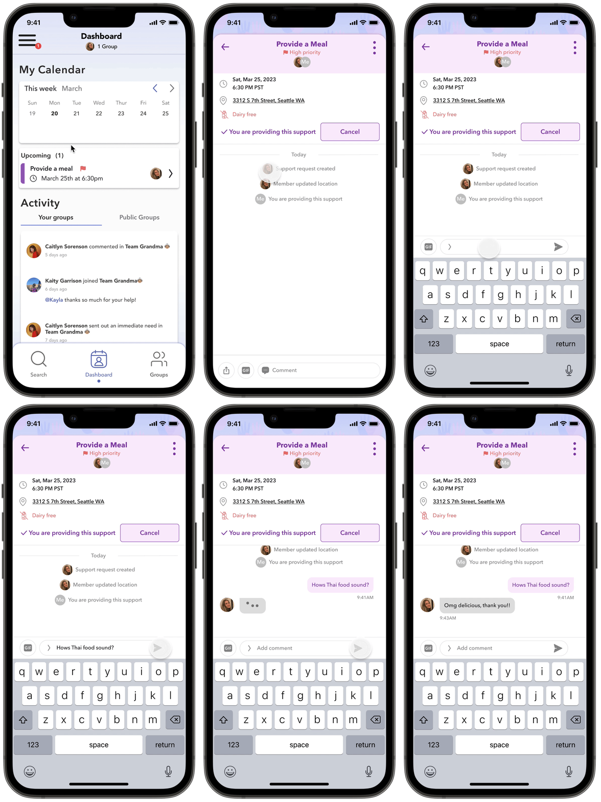
An app that connects users seeking support from their communities
